uPay
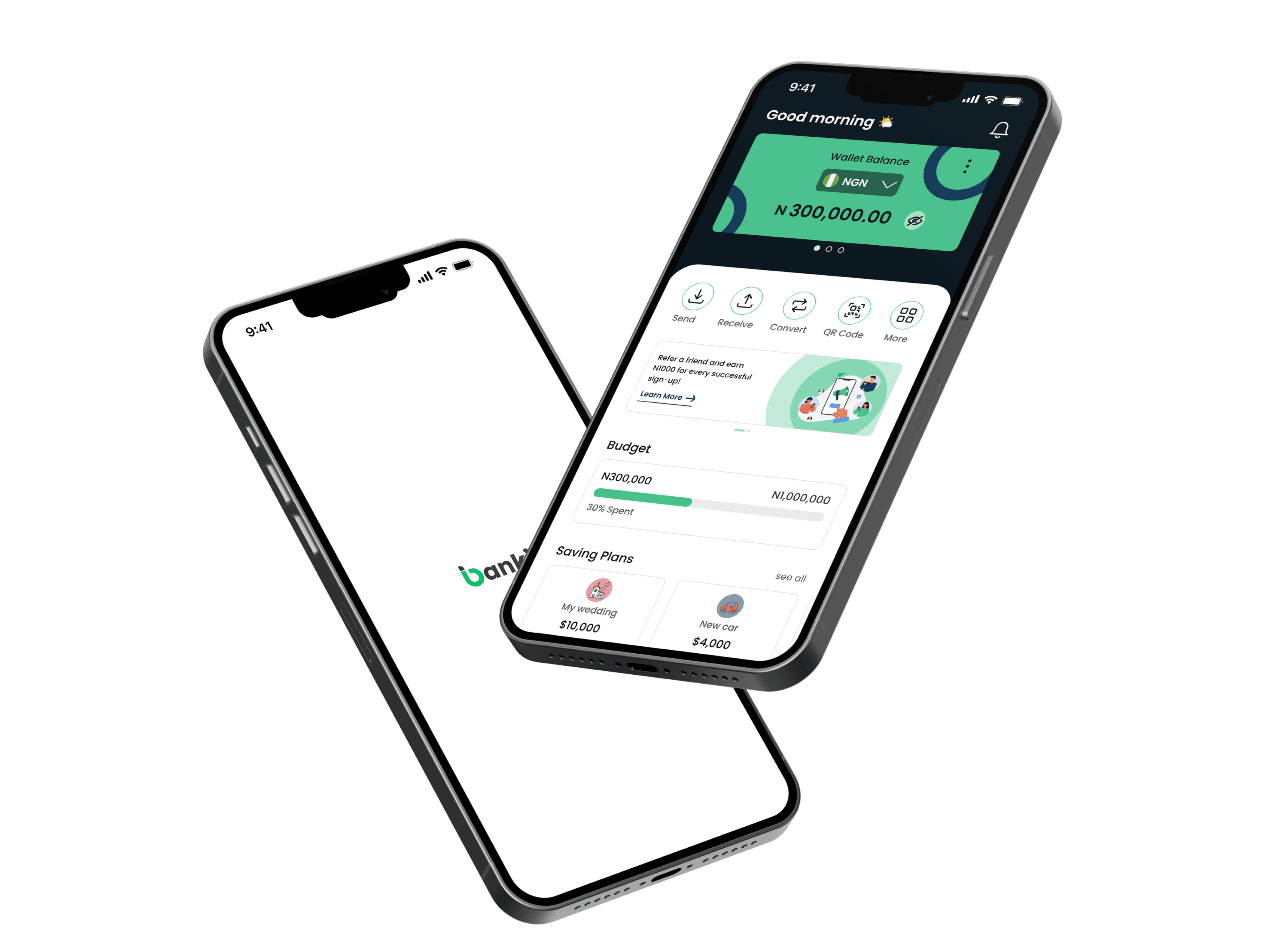
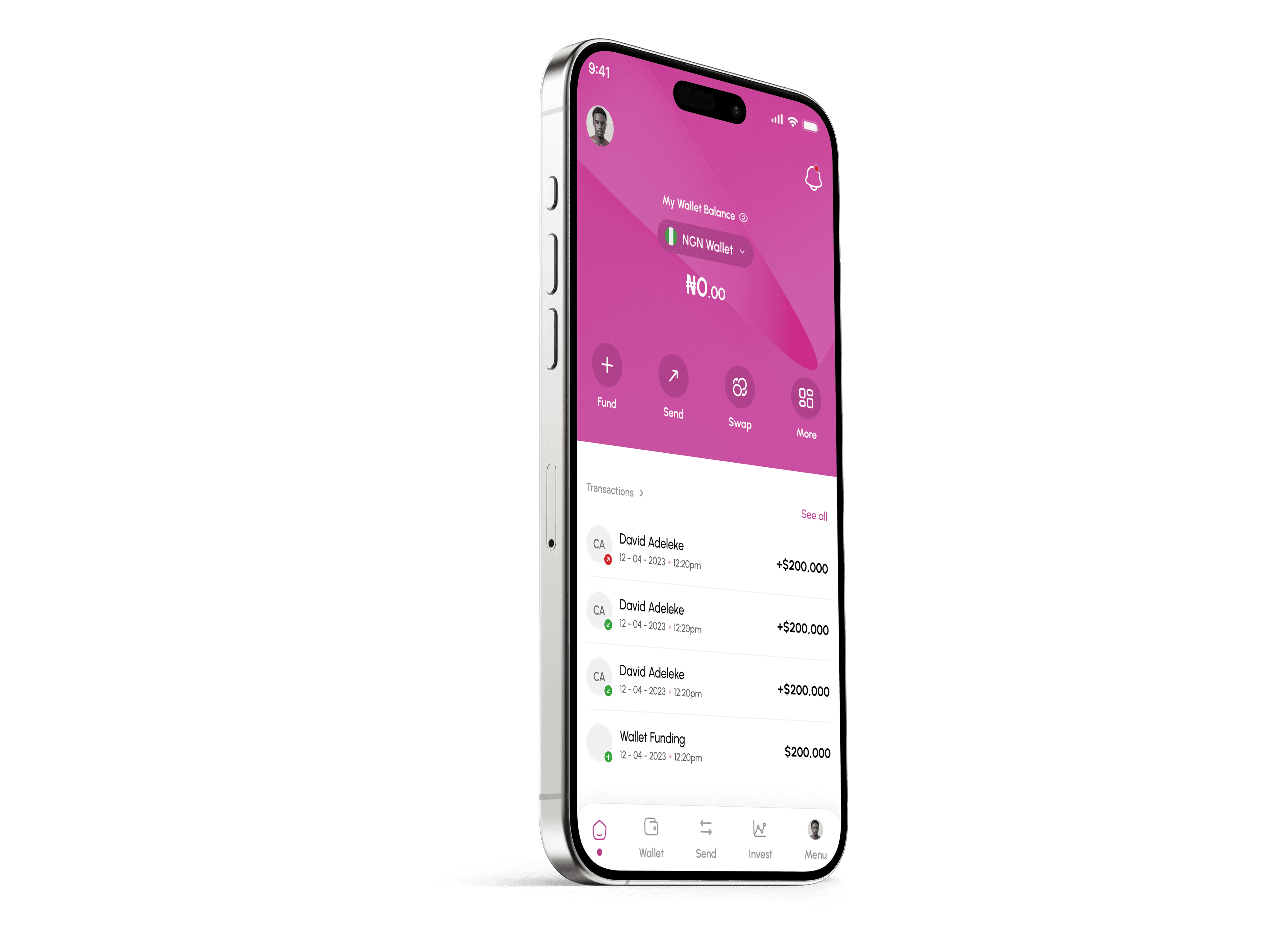
uPay is a fintech platform designed to deliver a seamless digital payment experience, enabling users to transfer funds, pay bills, and manage their finances with ease.
Problem Statement
The goal was to design a modern and efficient digital payment platform that:
Simplifies fund transfers and bill payments.
Enhances security and trust for users.
Provides a competitive UX compared to existing fintech solutions.


Research & Insights
User Pain Points
Through market research and competitor analysis, I identified key user pain points:
Complex onboarding – Users struggle with registration on most fintech platforms.
Slow transactions – Existing solutions had issues with transaction speed and reliability.
Cluttered UI – Many apps overloaded users with too many options, creating confusion.
Competitor Analysis
I analyzed leading fintech apps (such as Opay, Kuda, and Chipper Cash) to identify industry standards and areas for improvement. Key takeaways:
Simplicity wins – Minimalist, well-structured dashboards improve user engagement.
Trust-building is essential – Users need clear security indicators and real-time transaction feedback.
Quick actions matter – Reducing the number of steps for transactions improves retention.


Challenges & Solutions
1. Balancing Simplicity and Functionality
Challenge: Reducing clutter while keeping essential features.
Solution: Prioritized features based on user needs and added collapsible sections for less-used functions.
2. Building Trust with Users
Challenge: Users hesitate to trust new fintech platforms.
Solution: Added visual security reinforcements like real-time notifications, transaction history transparency, and biometric authentication options.
Conclusion
While the design wasn’t ultimately approved, it was a strong exercise in balancing usability, aesthetics, and functionality. The insights gained from this project will be applied to future fintech UX projects to further refine my design approach.